Why ‘where’ matters
By Esri Canada
Dealing with the COVID-19 pandemic has led us to new ways of looking at the world and each other. Understanding where the hotspots are is fundamental to understanding how to respond. Where is help needed first? And where will it be needed next?
The science of where is what Esri is all about. As the world leader in geographic information system (GIS) technology, Esri uses the lens of location to unlock data and information, and reveal patterns. We have always known that ‘where’ matters, and in 2020, due to the pandemic, it weighs heavier in public health.
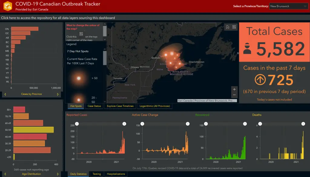
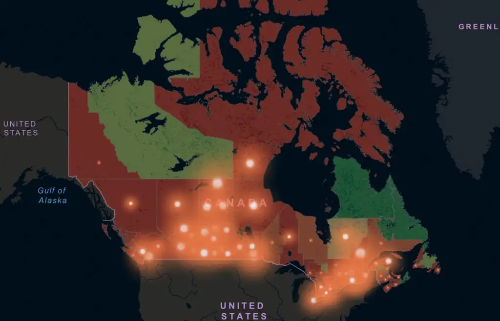
The Johns Hopkins University dashboard that graphically shows where COVID-19 has spread is perhaps the most viral GIS-based application the world has ever seen. Named one of TIME Magazine’s Best Inventions of 2020, the dashboard has received billions of views, and it has inspired the creation of thousands of dashboards and maps around the world, from Korea to Colombia. People want to see what is happening in their city, their province—and governments depend on data to implement safety restrictions.
We know that public health agencies are under enormous pressure to provide better data about the pandemic. We believe location intelligence can help you see health data in an insightful way.
Esri Canada is providing a wide variety of free resources for Canadian health professionals. Our COVID-19 Canada Resource Hub has holistic information about the outbreak in Canada, including bilingual maps, apps and other resources. It is constantly updated and features several dashboards: Canadian outbreak tracker, regional trends and community health, among other resources, which you can use to understand the pandemic. The hub also includes ready-to-use COVID-19 recovery solutions.
Managing health data is complicated; it differs from province to province. But the demand is clear. For example, hospitals need to predict if they have the capacity for people who need it. Do they have enough beds, ventilators, and PPE for health workers? Answering these questions informs better community resilience and what we call ‘location allocation.’ Who needs what, and where?
Some other capabilities when using a GIS approach—putting your data on a map and conducting spatial analysis—are:
- Find out where the pandemic is going
- Identify where the most vulnerable populations are
- Manage, share, and collaborate on the insights from collected data
- Focus the questions about vaccine distribution in the most effective and efficient way
- Enhance situational awareness and see key metrics for making better allocation decisions
Esri Chief Medical Officer Dr. Este Geraghty and Esri Canada President Alex Miller discussed the value of location analytics, innovation during crisis, and strengthening collaboration and public health preparedness at HIP Week 2020. If you have access to this content, watch the recording—Location analytics: The next wave in managing Canadian health data.
Free webinar series: Using GIS from Data Gathering to Storytelling
In 2021, Esri Canada will host a free webinar series for CHIMA members so you can learn how to map, analyze, and share health data using GIS. You’ll learn about:
- Key GIS concepts
- Working with data and maps
- Demographic analysis
- Creating dashboards and story maps
Mark these dates on your calendar:
- Part 1: Wed, January 20, 12 pm ET
- Part 2: Wed, January 27, 12 pm ET
- Part 3: Wed, February 3, 12 pm ET
Registration will open in January.
For more on GIS for public health, visit esri.ca/chima.
Accessing Location analytics: The next wave in managing Canadian health data (0072)
Esri Canada’s HIP Week 2020 presentation can be accessed by purchasing either a full pass or the keynote and side chat bundle.